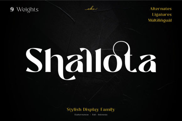
Shallota: A Bold Display Font for Confident Digital Branding
As a UI designer who ships landing pages, SaaS dashboards, and boutique e-commerce sites, I choose display fonts not just for flair—but for function. Shallota stands out because it delivers elegance without sacrificing clarity. It’s a display font built for digital presence: smooth curves, confident proportions, and a rhythm that guides the eye—not fights it. Whether you’re designing a hero section for a fashion brand or crafting a premium course sales page, Shallota anchors your layout with intention.
Visually, Shallota balances boldness and refinement. Its letterforms feature subtle contrast, open counters, and generous x-height—traits that boost legibility even at smaller sizes on screen. Unlike many decorative display fonts, it avoids excessive ornamentation, making it highly adaptable across devices. On mobile, it holds its shape in headlines down to 28px; over light or dark image overlays, its clean weight distribution ensures readability without heavy text shadows or excessive contrast tweaks.
Where Shallota Earns Its Place in Your Layout
Shallota isn’t meant for body copy—and that’s by design. It shines where hierarchy matters most:
- Hero section headlines — Paired with a neutral sans serif (like Inter or Manrope), Shallota creates instant tonal distinction. A coaching website using “Clarity Starts Here” in Shallota above a clean paragraph instantly signals sophistication and calm authority.
- Landing page CTAs — Used sparingly on primary buttons (“Join the Studio”, “Get Early Access”), it adds visual weight without shouting. Just avoid sub-20px sizing—reserve it for medium-to-large button labels only.
- Branded banners and product cards — In online stores selling artisan goods or luxury apparel, Shallota on category headers (“New Arrivals”, “Limited Edition”) reinforces exclusivity while remaining scannable.
- Blog post titles and editorial graphics — Its smooth vibe supports storytelling. Think of a sustainable lifestyle blog using Shallota for article headers alongside a warm serif like Lora for body text—creating a magazine-like digital rhythm.
Readability & Responsiveness: Practical Notes
Shallota is PUA encoded, meaning all alternates, ligatures, and stylistic sets are accessible via standard font tools—no complex OpenType setup needed in Figma or Webflow. For web use, confirm the vendor provides WOFF2 files optimized for fast loading. When self-hosting, always include fallbacks: font-family: "Shallota", -apple-system, BlinkMacSystemFont, "Segoe UI", sans-serif;
On dark mode interfaces, test contrast carefully: Shallota’s medium weight reads cleanly against charcoal (#1e1e1e) but may need slight letter-spacing adjustment at 32px+ to prevent visual crowding. Over photography, use a subtle semi-transparent overlay or soft drop shadow—never rely solely on background brightness to carry legibility.
Smart Pairing for Digital Consistency
Display fonts live or die by their companions. Shallota pairs best with typefaces that recede gracefully—letting it lead while supporting comprehension. Try these combinations:
- A geometric sans serif (e.g., Inter or IBM Plex Sans) for all UI text, navigation, and body copy—clean, neutral, highly legible.
- A low-contrast serif (e.g., Lora or Cormorant Garamond) for long-form content or editorial sections where tone and texture matter more than speed.
- A monospace (e.g., JetBrains Mono) for code snippets, pricing tables, or technical highlights—creating deliberate contrast without competing visually.
Avoid pairing Shallota with other high-contrast or script-based display fonts—they’ll clash in tone and disrupt visual flow. And never pair it with another bold decorative font in the same viewport; hierarchy collapses when everything shouts.
Licensing for Real-World Use
Shallota is a commercial font—meaning you’ll need an appropriate license for client work, SaaS platforms, or online stores. Most reputable vendors offer clear tiers: one-site, multi-site, or extended licenses covering templates, digital products, and white-label assets. If you’re building a Shopify theme or Notion template for resale, verify the license explicitly permits redistribution. For internal brand kits or agency projects, a standard desktop + web license usually suffices—but always check the EULA before embedding.
Also note: While Shallota includes extended Latin support, verify multilingual coverage if your audience spans French, Spanish, or Eastern European languages. Some display fonts omit diacritics or fail on accented characters in headings—test key phrases before launch.
When to Reach for Shallota—And When to Pause
Reach for Shallota when you need to signal confidence, creativity, or curated quality—especially in contexts where users make quick judgments: a portfolio site header, a limited-edition product launch banner, or a premium newsletter signup form. Its smooth vibe communicates care and intentionality, which directly impacts perceived brand trust.
Pause if your layout relies heavily on small-scale text elements—like micro-interactions, tooltip labels, or dense dashboard cards. It’s not built for those roles. Likewise, avoid it in accessibility-critical areas (e.g., error messages or form validation) unless paired with a WCAG-compliant fallback and tested with screen readers.
In practice, I’ve used Shallota successfully on a ceramic studio’s online shop (hero + collection headers), a UX writing course sales page (headline + module titles), and a wellness brand’s email campaign series (subject lines + banner text). Each time, it elevated tone without compromising usability—because great display fonts don’t distract; they distill.