Brushor: A Brushed Display Font for Distinctive Web Design
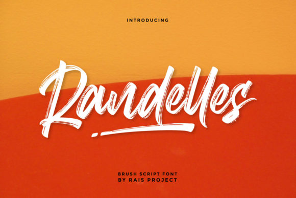
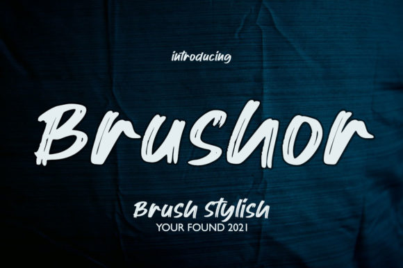
As a web and UI designer who ships digital products daily, I treat typography like infrastructure—not just decoration. A display font like Brushor doesn’t live in body copy or navigation menus. It lives where first impressions happen: hero sections, product headlines, brand statements, and conversion-critical CTAs. Brushor is a cool, hand-brushed display font—visually textured but digitally refined—with subtle irregularity, soft contrast, and confident rhythm. Its strokes carry the warmth of analog craft while rendering cleanly across modern browsers and devices.
What makes Brushor work so well in real layouts? It’s not overly ornate, nor does it sacrifice legibility for style. The brush effect is present but controlled—enough to signal creativity, authenticity, or artisanal care without undermining scannability. On a landing page headline like “Launch Your First Course,” Brushor adds tonal weight and personality that generic sans serifs can’t match. It tells users, before they read a word, that this is human-led, intentional, and thoughtfully built.
Where Brushor Earns Its Place in Digital Layouts
Brushor shines in high-impact, short-form contexts:
- Hero section titles—especially on creative portfolios, coaching sites, or boutique e-commerce banners where brand voice must land instantly;
- Section headers that break up long-scroll pages (e.g., “How It Works” or “What Clients Say”)—adding visual punctuation without competing with content;
- CTA buttons with 2–4 words (“Get Started”, “Join the Waitlist”)—where its tactile quality increases perceived value and click intent;
- Blog post headers or newsletter banners—giving editorial content a distinctive, magazine-like tone;
- Digital ad creatives and social media graphics—scaling cleanly from mobile feeds to desktop retargeting banners;
- Course sales pages and SaaS onboarding flows—softening technical messaging with approachable humanity.
It’s not ideal for paragraph text, dense tables, or small interface labels. Brushor is a display font—meant to lead, not support. Use it where you want attention, emotion, and memorability—not neutrality.
Readability & Responsiveness: Practical Considerations
Brushor performs reliably across devices when used intentionally. On mobile, keep sizes ≥28px for hero text and ≥20px for section headers. Avoid using it below 16px—even with generous letter-spacing, detail loss begins to affect recognition. For dark backgrounds, ensure sufficient contrast (aim for ≥4.5:1 against mid-to-light grays or off-whites). On image overlays, add a subtle semi-transparent background or text shadow to preserve clarity.
Its brushed texture holds up well at larger sizes, but avoid stretching or compressing via CSS transforms—those distort the natural stroke balance. Always serve Brushor as a properly optimized webfont (WOFF2 preferred) and verify fallback behavior in case of loading delays. Test how it renders on iOS Safari and Android Chrome—some brushed fonts behave unpredictably with subpixel antialiasing, but Brushor was engineered for cross-browser consistency.
Smart Pairing for Balanced Digital Typography
No display font works in isolation. Brushor pairs exceptionally well with clean, neutral sans serifs—think Inter, Manrope, or Poppins—for body copy, navigation, and form fields. That contrast creates clear visual hierarchy: Brushor sets the tone; your sans serif delivers information. For editorial or luxury-leaning brands, try pairing with a restrained serif like Lora or Cormorant Garamond—just be sure to limit serif use to pull quotes or bylines to avoid visual competition.
Avoid pairing Brushor with other decorative fonts (script, handwritten, or distressed), unless you’re deliberately building a layered, collage-style identity—and even then, limit it to one accent per screen. Consistency matters more than variety when reinforcing online identity.
Licensing, Formats & Real-World Integration
Brushor is a premium font, available in standard OpenType (OTF) and web-optimized WOFF2 formats. Most licenses include desktop, web, and app usage—critical if you’re designing templates for clients or selling digital products. Always confirm licensing covers your use case: embedding in a Shopify theme, serving via CSS @font-face on a SaaS dashboard, or bundling into a Figma UI kit all have different requirements. Some versions include stylistic alternates and multilingual glyphs (Latin Extended-A), which matter for global-facing sites or bilingual content.
When integrating Brushor into a design system, define strict usage rules: “Brushor only for H1s and primary CTAs; never for body, captions, or error states.” That discipline ensures brand cohesion across pages, campaigns, and team members—even when designers rotate on a project.
Why Brushor Fits Today’s Digital Brand Needs
In an era of algorithm-driven sameness—where every SaaS homepage looks eerily similar—Brushor offers a quiet but effective way to differentiate. It signals craftsmanship without pretension, confidence without coldness. Whether you’re launching a ceramic studio’s online store, a mindfulness app’s waitlist page, or a freelance designer’s portfolio, Brushor helps your brand feel grounded, intentional, and human.
It’s not about being “trendy.” It’s about choosing a display font that aligns with how your audience perceives trust, quality, and voice—and then using it with restraint, clarity, and purpose. That’s how Brushor moves beyond aesthetic choice into strategic design asset.