Bello: A Sweet, Friendly Display Font for Digital Brands
As a UI designer who ships landing pages, SaaS dashboards, and e-commerce experiences daily, I pay close attention to how typography shapes perception before a single word is read. Bello stands out—not because it’s loud or experimental, but because it’s genuinely warm, approachable, and human in its rhythm. It’s a display font that doesn’t shout; it leans in and smiles. That subtle shift makes all the difference when building trust, guiding attention, or reinforcing brand tone across digital touchpoints.
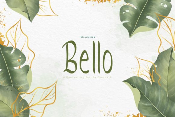
Visually, Bello balances soft curves with confident structure. Its letterforms feel hand-informed—not script, not calligraphic—but naturally fluid, with gentle contrast and open counters that breathe on screen. There’s no forced quirkiness or exaggerated flair. Instead, Bello delivers quiet confidence: rounded terminals, consistent x-height, and generous spacing that supports legibility even at smaller display sizes. On mobile, it holds up well in hero headings above 32px—and with proper line-height and letter-spacing adjustments, it remains scannable in responsive banners and app onboarding screens.
Where Bello shines most is in tone-setting moments: the first thing users see. Think of a coaching website’s hero headline (“You’ve Got This”), a boutique skincare store’s product banner (“Gentle. Radiant. Yours.”), or a creative course’s sales page header (“Design With Intention”). In each case, Bello adds sincerity without sacrificing polish. It signals care—not just in messaging, but in execution. That emotional resonance directly supports conversion-focused layouts: users linger longer, connect faster, and perceive the brand as both professional and personable.
It’s not a body font—and shouldn’t be used as one. Bello is purpose-built for impact at scale: hero titles, section headings, CTA buttons (when sized appropriately), logo lockups, and decorative accents like quote pulls or testimonial highlights. For example, pairing Bello with a clean, neutral sans serif—like Inter, Poppins, or Manrope—for paragraph text creates reliable visual hierarchy. The contrast is intentional: Bello draws the eye, while the supporting type ensures effortless reading. For editorial or luxury-facing sites, try pairing it with a refined serif like Cormorant Garamond—just keep body copy in the serif and reserve Bello for high-impact moments only.
Readability in context matters. On light backgrounds, Bello performs beautifully with standard black or dark gray (#333333). Against dark mode interfaces or image overlays, use a crisp white or off-white with sufficient contrast (check WCAG AA compliance at 4.5:1 minimum). Avoid thin weights on small buttons—stick to medium or bold variants for CTAs under 200px wide. And always test spacing: tight tracking can blur character distinction on mobile; loosen it slightly (letter-spacing: 0.5px–1px) for clarity without losing charm.
Practically speaking, Bello includes multiple OpenType features—standard ligatures, stylistic alternates, and multilingual support covering Latin-based languages (including accented characters for French, Spanish, German, and more). It ships in WOFF2 format for optimal web performance and is licensed for commercial use across websites, client projects, online stores, digital templates, and brand asset libraries. Just ensure your license covers webfont embedding—some versions are desktop-only, and using an unlicensed font on a live site risks legal exposure and inconsistent rendering.
In real-world projects, I’ve used Bello to unify brand identity across channels: a portfolio site where it anchors project titles and section dividers; a wellness newsletter where it headlines featured articles and opt-in prompts; and a digital product launch page where it reinforces the “human-first” positioning alongside minimalist UI elements. Each time, it elevated tone without distracting from function. It never competes with interface elements—it complements them.
What makes Bello especially valuable today is its restraint. So many display fonts chase novelty, but Bello opts for authenticity. That makes it easier to maintain consistency across a digital ecosystem—from email headers and social media graphics to in-app modals and PDF pitch decks. When your brand voice is empathetic, thoughtful, or quietly confident, Bello becomes part of the narrative—not just decoration.
Font pairing isn’t theoretical—it’s tactical. For fast-loading, accessible web design, serve Bello as a single weight (typically Medium or Bold) via @font-face, and pair it with a system-font stack fallback for body text. This keeps performance tight while preserving personality where it counts. If you’re building a Figma design system, include Bello in your typography tokens for H1–H3, then document clear usage rules: “Bello is for primary headlines only; never for navigation labels, form fields, or data tables.” Consistency builds recognition—and recognition builds trust.
Finally, remember that typography is one of the few design elements users experience across every platform and device. Bello’s natural flow translates well to both retina displays and older mobile screens—not because it’s technically perfect, but because its proportions and spacing were designed with real-world readability in mind. It’s not about being everywhere; it’s about being *right* where it matters most.
- Best for: Hero sections, landing page headers, CTA buttons (≥24px), logo text, blog post titles, social media banners
- Avoid for: Body copy, dense lists, small interface labels, data tables, long-form paragraphs
- Ideal pairings: Inter, Poppins, Manrope (sans serif); Cormorant Garamond, Lora (serif)
- Licensing note: Confirm web embedding rights—commercial licenses vary by vendor
- Performance tip: Load only the weights you need; compress with WOFF2 and preload critical fonts